Agos Bank
The AI-driven instant lending for tomorrow's clients
Timeline
April 2024, 4 weeks
Client
Agos Bank
My Role
UX/UI Designer
Team
Mattia Bordegoni, UI Designer | Jurgen Jace, UX/UI Designer | Sara Fratusco, UX/UI Designer | Lara Tisti, UX Designer
Overview
Research and redesign an innovative AI-driven instant lending process for Agos Bank, reducing request approval time from 5 days to 10 minutes and improving transparency for clients.
Introduction
Background
Agos is a financial partner of Crédit Agricole and Banco BPM banks specialised in granting and managing consumer loans up to €30,000.
At the project kickoff, customers could not complete loan requests entirely online. Although they could initiate applications via the website or mobile app, they were required to proceed through multiple steps, including interacting with a telephone agent and visiting a branch.
This cumbersome process resulted in a long waiting period (an average of 5 working days) and a user abandonment rate of over 40%.
Objectives
Alessandra Cometa, Head of Product and Digital, and Martina Esposito, Customer Experience Specialist, challenged us to redesign from scratch the online loan application flow on the Agos website.
The business objectives included drastically cutting application approval time, decreasing the customer abandonment rate, and improving the overall user experience, with a particular focus on mobile users.


Focusing on the user
Current situation
We started analysing the current flow by using experience maps and customer journeys to identify friction points and explore potential areas of improvement. The main pain points we focused on were:
visual and organisational confusion through the steps to follow to make a loan request, including repeated and unjustified requests
lack of separation between the simulation and the actual request, leading the user to submit a loan request unknowingly
switching to different platforms in the course of the application, which causes puzzlement in the user and leads to abandonment
repeated and unjustified requests for personal information
poor accessibility and readability, both in texts and buttons.
User Research
We also conducted extensive desk research, interviewed 17 individuals and surveyed 100+ people to gather more information about their expectations and the issues they encountered in this kind of process, learning about their previous experiences.
Based on their answers, we gathered their most relevant quotes, elaborated 6 insights and developed a personas that guided us in designing the final solution.


Scouting the market
Benchmark
Delivering the solution
Key features
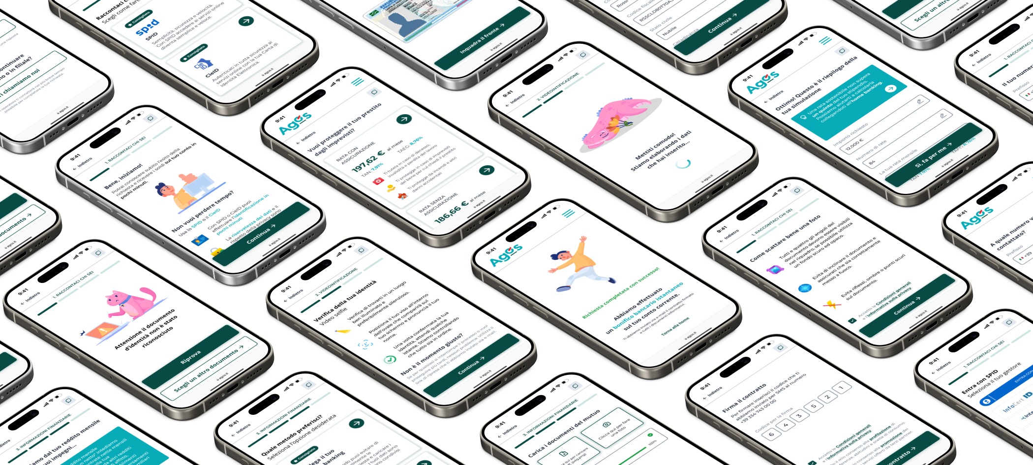
The process has been completely redesigned from the ground up to guide users step-by-step through the loan application, providing precise and clear information throughout.
By integrating tools such as SPID, the Italian government's digital identity system, and direct link to personal home banking, the loan application process has been significantly sped up and simplified for users. This integration also enables Agos to collect more data, allowing for more precise and faster responses through the use of AI-driven tools in the background, thereby reducing the risk of bad debt.
Furthermore, special attention was given to accessibility, one of the core principles of the design. This includes a focus on the readability of text and the usability of buttons, ensuring a seamless experience for all users.
Final result
The outcome was a radical cut of the application approval time from 5 days to 10 minutes and the possibility to complete the loan application entirely online, without going through other channels.